
Clarence & Matthew
Wedding Invitation Package
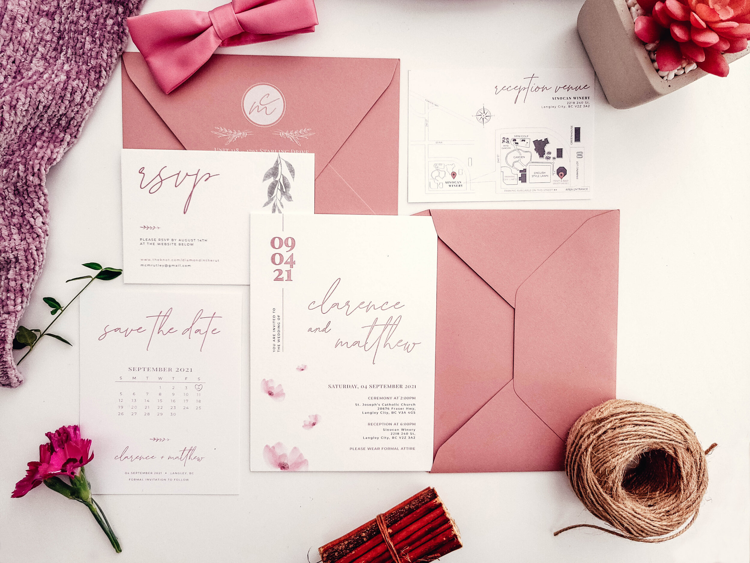
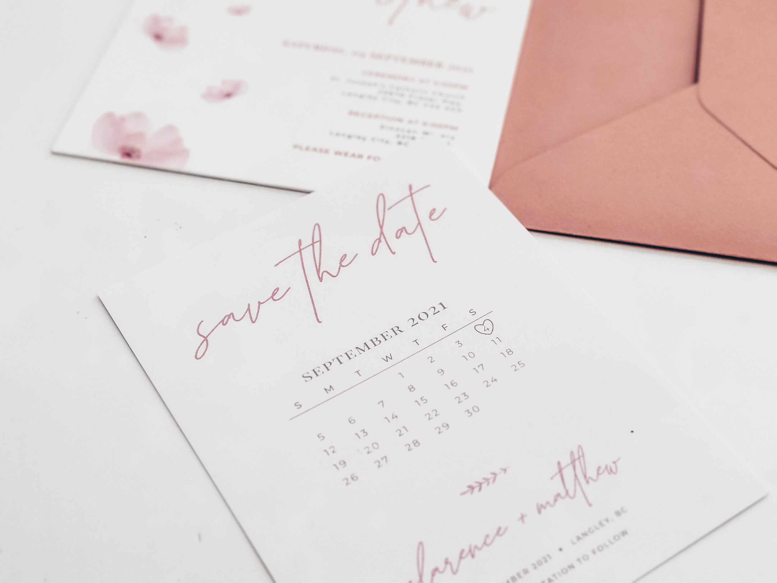
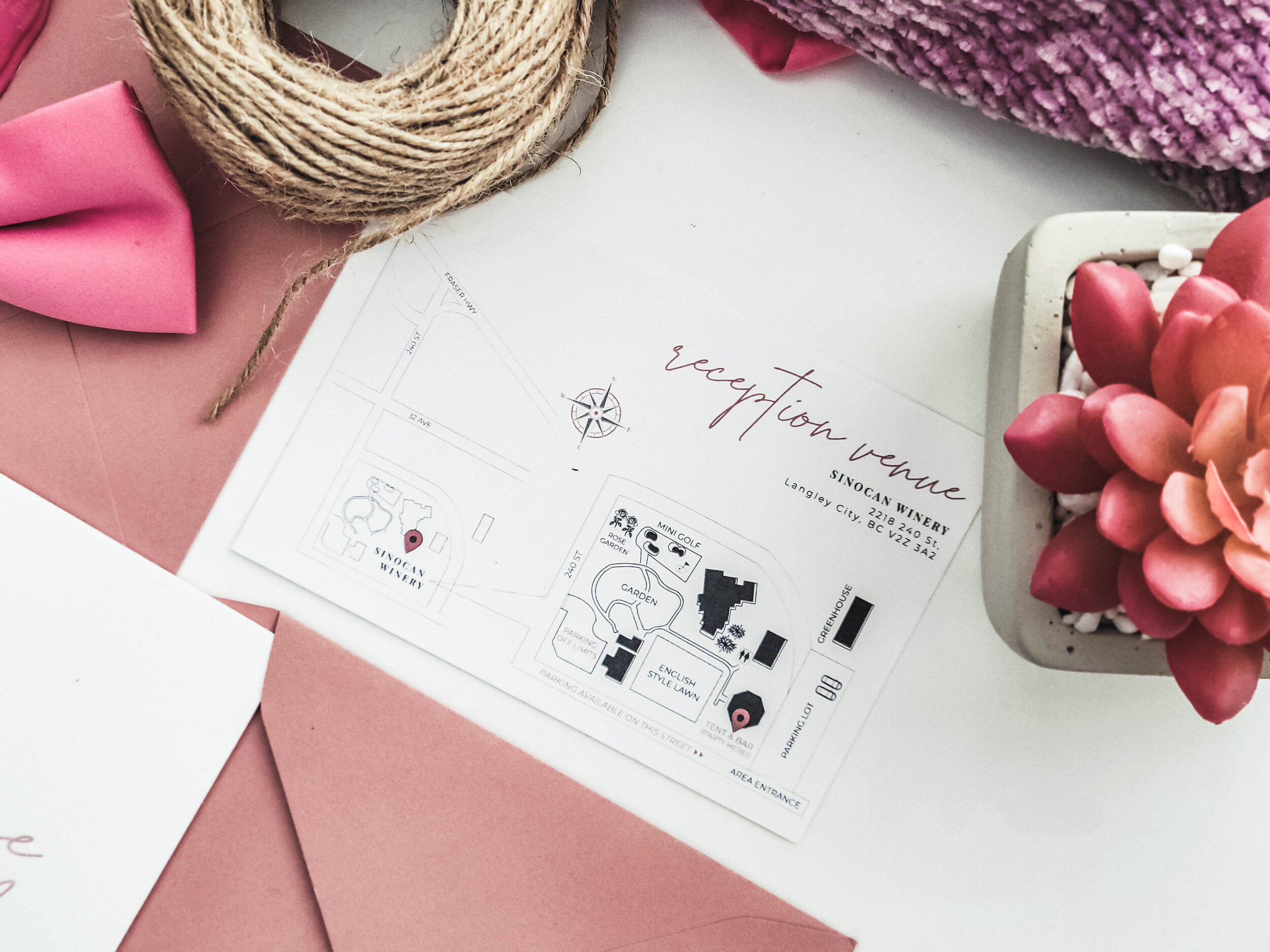
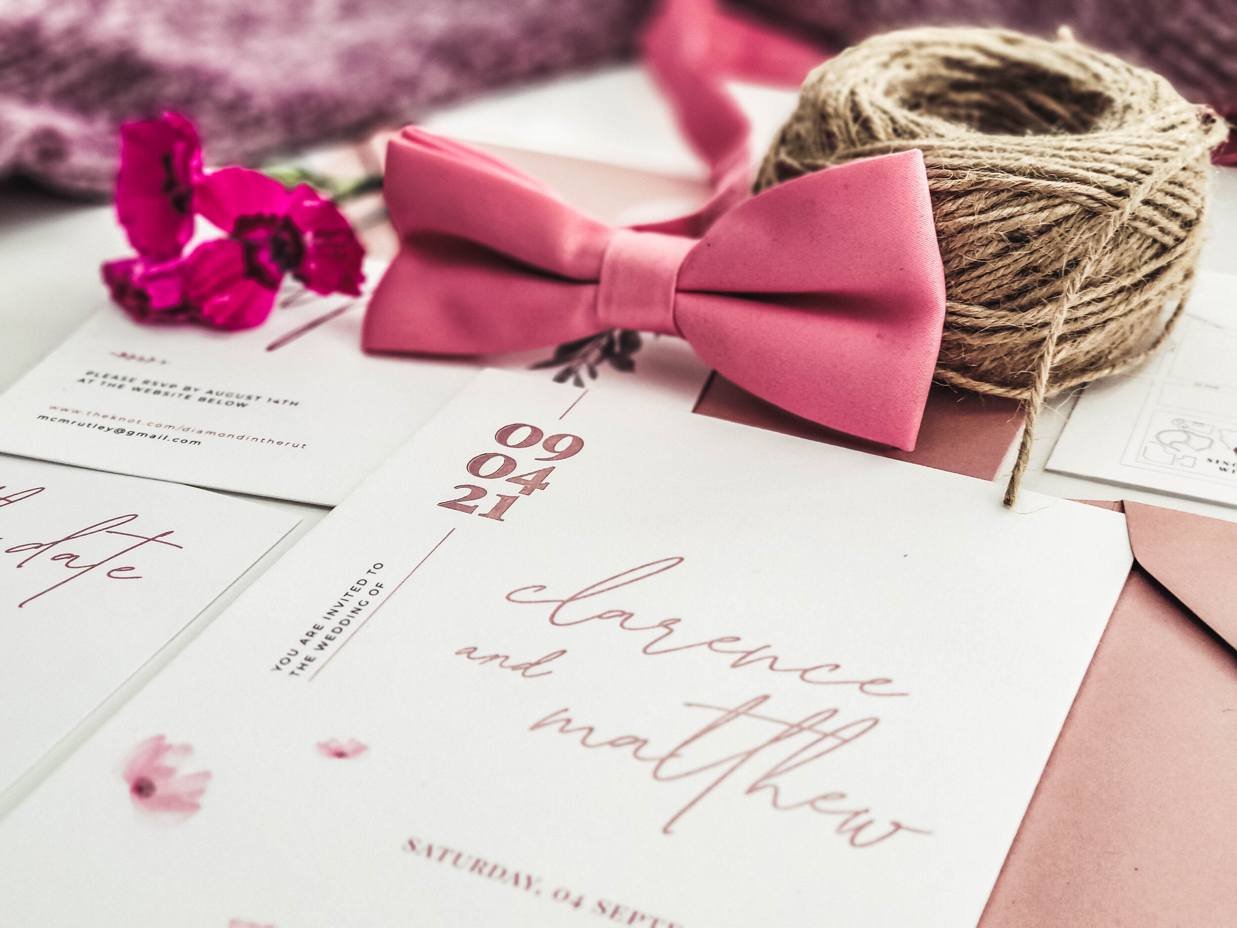
The planning that initiated the branding for this wedding invitation project started from the bride’s thoughts to have a personal touch on every design piece while also keeping within the boundaries of minimalism and elegance. Combining all these elements, this became apparent in my design starting with the style of handwritten script font for the headings and embossed titles and dates that matched with flower illustrations. Altogether, I was able to design an invitation that not only aligns with the wedding’s branding style and colour theme, but also compliments the whole occasion.